Take my advice. Do not under any circumstances decide to start two new websites at more or less the same time. Not only will your self-image as a demon web-designer, photo-blogger par excellence and creator of deathless prose end up seriously dented, your patience and your sanity will be tried . And the patience and sanity of those nearest and dearest to you.
Also, your regular work-flow will be catastrophically interrupted. (Even if, like mine, it’s not so much a flow as an occasional ketchup-bottle glop.)
Howsomever, you will get a great sense of relief when you realise – as I did today – that the bulk of the work (for one of the websites at least) is complete.
Two websites
The two websites I’m writing about are as follows. One is my new photo-blog Gothenburg 365 (also known as GBG365). The other is the new site dedicated to my on-going writing endeavour, Elin’s Story.
You can’t see much of Elin’s Story yet. It’s not fit to be seen and won’t be for a while. But if you’re interested follow this link to visit the front-page teaser I’ve got showing.
www.elinsstory.com
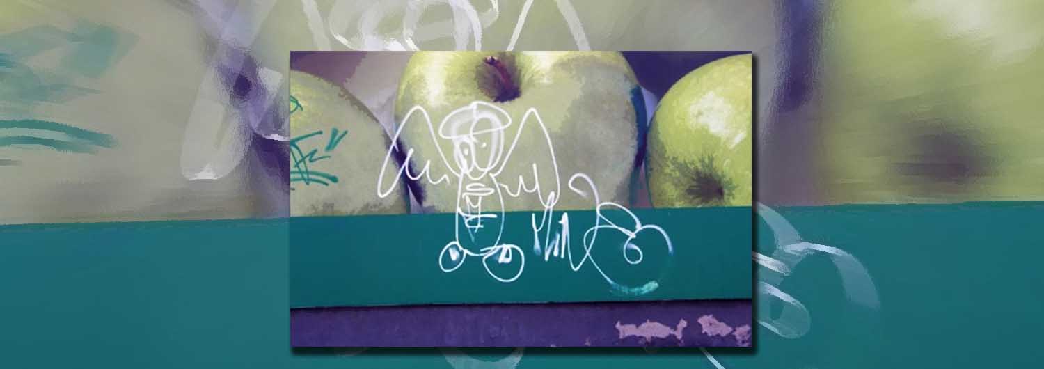
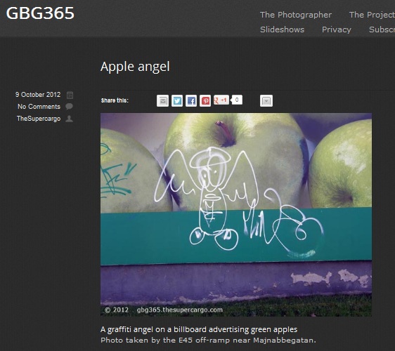
The photo-blog, though, is almost presentable. Go here: GBG365.thesupercargo.com The plan is to post a picture a day for a whole year. All the photos will be taken within the limits of the Gothenburg urban area. (An urban area that includes a good deal of rural and fluvial space too. And seaside.)
I started the project on 1st September just after I got back from my holidays. I’ve managed to keep it up for a month and a half now. There have only been five days so far when I’ve not been able to post a recent picture. I’ve filled in with a picture from approximately the same time – though from an earlier year – from my archives. There’s a bit of a challenge coming up, but I have high hopes of getting through the whole year.
I’m not claiming great artistic merit for the pictures, but I hope they will appeal to some people at least. There are several options to share the photos and I hope some people will be enthusiastic enough to subscribe to daily updates by e-mail or RSS.
Eclipsing problems
My inspiration comes from several photo-geek friends and acquaintances on Twitter, Ipernity and Flickr. People who have successfully completed similar 365 projects. (I’ve also been inspired – and I hope learned about pitfalls – from one or two less than successful attempts.)
The biggest problems I’ve encountered (and which have contributed to the aforementioned dented self-image and fits of screaming frustration) have been largely connected to the design of the blog and the interaction – or lack of interaction – between different bits of software I’ve tried to use. I opted to buy (for a modest sum) a WordPress theme called Eclipse Pro. This is a responsive theme, meaning it resizes itself to the format of the device the web page is being viewed on. This aspect of it works very well.
Unfortunately, I got it into my head that Eclipse Pro had been designed specifically for photoblogs. The images on the demo site and words and phrases like ‘image slider’, ‘portfolio’ and ‘beautifully display photos’ may have had something to do with that. It took me a while before I realised my mistake.
Inflexible
In truth, despite its responsive features, I find Eclipse Pro rather inflexible. (I think it’s actually intended as a commercial site for showing off a small portfolio of products.) Pictures must be specially cropped and uploaded to fit into the slider, the portfolios and various boxes. A lot of the fine tuning (for example the colours of different background elements) involves CSS programming. Programming skills that I don’t have.
I can say I have received courteous, prompt and mostly helpful advice from the two gents who seem to be running the technical support for the software. But there’s a limit to what they can do to remold the programme to my heart’s desire.
So, it’s also been necessary to find separate plugins to display the photos satisfactorily. Now I’ve pared down the full size blog images so they won’t explode out to fill the screen in a lightbox when you click on them either. (They started out at 900px by 750 px; now they are 800px by 600px.) The front page presents the most recent five images as thumbnails – for reasons of loading speed. But, I’m happy with the way it looks for now.
The main thing missing is a slideshow, but I’m working on that. In the meantime the pictures are there, so if you’d like to visit, please drop in.
And there will be more on Elin’s Story in a later entry. [Here’s a link to my Elin’s Story tag.]
[Published prematurely on 11th October 2012, updated and republished on 16th.]


I think you advice should be written on a ballon and sent in an orbit around the world. I also tried making two websites in one go this summer. And I doubt my sanity will ever recover from the experience. I thought it was going to be effecient and clever but not so…
I’ll see what I can do about that – there must be a spare helium baloon floating around somewhere after that Austrian guy jumped off it the other day. 🙂
It’s been a bit like beating your head against a brick wall- lovely when you stop. Anyway, I’m not going to worry much about the photoblog from now on – just add pics.
Sounds like a good idea. Both of them actually. Find some use for the spare baloon and just adding pics instead of worrying about design. I think I’ll do likewise.