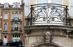
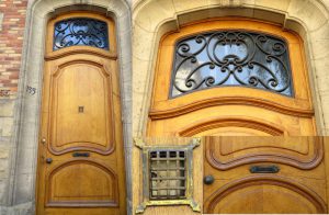
Of all the cities that I have lived in, Brussels seems to have the most varied architecture. It’s revealed not just in the shape of the buildings but in the details and decoration.
Brussels in my head
 Before we moved here I had no unified image in my head of the city, though I had visited three or four different times when I had been involved in EU schools projects. Each of those visits must have been to a different quarter of the city. Each was so different from the others.
One visit must have been to the European quarter because I have memory of tall buildings sheathed in mirror glass. Another must have been to a district where there was a strong French influence on the buildings – somewhere fairly central but not so modern. A third memory is of slabs of brutalist concrete, which I think now must have been the campus of the Free University of Brussels. My fourth visit must have taken place in December and coincided with the Christmas market in the Grand Place. I remember a freezing mist and lots of tawdry decorations.
Living here and walking the streets I’m beginning to get a better grasp of how Brussels has grown and developed. I think it must always have been a very wealthy place. Also a place of considerable individualism where the outward impression its citizens wanted – perhaps still want – to give to others has been important.
Sweden and Britain
 In Sweden architecture tends to be either very “classical” or very time specific. Classical means made from wood and painted in a narrow range of colours among which Falu red and yellow ochre predominate. This contrasts with the stone buildings from the late 1800s onward. These tend to be much more influenced by international architectural trends. But one thing is very particularly Swedish. All buildings built at more or less the same time resemble one another closely. In more modern decades, whole quarters seem to have been built according to the same design even when erected by different builders. Swedes, it seems, do not wish to have their houses look different from their neighbours’.
In Britain you see more variety. People often pride themselves on making their gardens unique or painting their front doors and window frames a distinctive colour. Yet it is still most common to see parades of houses that all look basically the same.
A confusion of styles?
Not so in Brussels. Here it is much more often the rule that each house is designed and built independently of its neighbours, even when it shares dividing walls with them. It is unusual to see even two neighbouring houses that share a pattern. Many houses, even ones that look quite modest, sport a stone inscribed with the name of an architect and the date of construction.
 You’d think this would make for a confusion of styles, but in fact it seems to harmonise rather well. Possibly because all the houses in any given quarter are more or less the same height and have more or less the same frontage. Or possibly because even though different architects may have designed each house, they often follow a similar period style, or – in the case of modern replacements – have been designed with sensitivity to the neighbouring styles. However, even ultra modern blocks filling gaps in the city’s streets often feel comfortable in their place. It’s only the huge residential blocks that seem out of place. Buildings that have gone up in certain areas to accommodate diplomats and Eurocrats.
Fortunately these monsters do not make up more than a fraction of the Brussels housing stock. It is the low rise townhouses that predominate in both wealthy and less well-off areas.
Iron-working details
The architectural design of so many buildings is not only to be seen in the structure of the buildings, but also in the way they have been decorated. Even if I didn’t know that Wallonia used to be an important iron-working region, I would certainly be able to guess that somewhere around here there must have been a tradition of iron-working. All the cast-iron features used to decorate Brussels houses are a giveaway. From the grills on the doors to the balcony balustrades, from the coal hole covers to the fan lights, the iron-working details are fascinating.
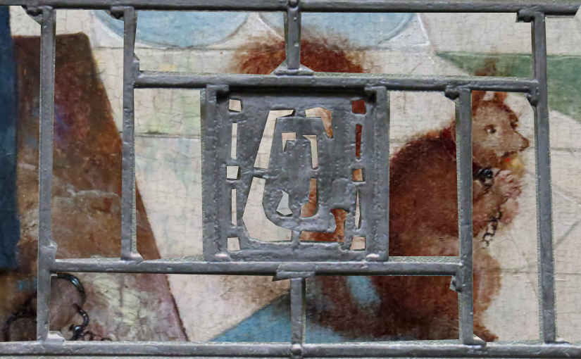
Visiting the Royal Museum of Fine Art and peering at the background details in many of the paintings, you get the impression that Belgians have always enjoyed focusing on funny little details.
Of course, funny little details and architectural flourishes make for a more interesting environment, but they aren’t necessarily either practical or ergonomic. I do sometimes feel it would be nice if Belgian architects (and indeed English architects) were to spend more time thinking about insulation, plumbing and heating. As their Swedish counterparts do. But you can’t have everything, I suppose.
This article was written for the #Blogg52 challenge.


While Swedish architects spend more time thinking about and planning for good plumming, insulation and heating, they actually have little to say about the color the building will take. At least for family houses, one has to apply for permission to paint a house in a color other than red or yellow.
Oh yes, I can well believe the colour you’re allowed to paint your house might be regulated in Sweden. I imagine the rules for what is an acceptable appearance for a house and what is not vary very much from place to place. Even here in Brussels, which is made up of 19 different municipalities, I think see that some districts are more strict than others – about how tall a building is allowed to be compared to its neighbours, for example.
I’m a fan of a British TV series called Grand Designs – shown on Swedish TV so you may know it – and while the extraordinary architectural adventures some of the programmes follow are always presented in a very positive light by the presenter (Kevin McCloud) there have been some in which it’s obvious the local authorities, and sometimes also the neighbours, have been very critical and made the builders and owners jump through hoops. It’s all part of the inevitable friction of living in close proximity to other people I suppose.
Well, why not? Maybe the education of architects should include compulsory years abroad – living in different houses!
I believe most people who become architects do so out of a love of buildings, so I’m sure they do just that, Eva. It’s just that they sometimes seem to forget about it when they actually find themselves designing places for people to live.
Hej John. Skriver på svenska idag! Många stockolmsfasader pryds av vackra skulpturer och ornament av sten. Har Bryssels hus det också?
Ja Anna, det finns mycket och vackert dekorationer på byggnader här, däremot är det intressant att det är ofta geometriska design eller blommor och frukt. Det är sellan man ser djur eller mythologiska motiv (om dem inte är caryatider eller lejon, som dyker upp lite överallt).