Back in March when I shared my first Header Art post, I explained that the WordPress theme I use calls for bespoke header images. I enjoy making these, but often the image doesn’t get so much attention. It’s illustrating a post, and the post is the thing, after all. So an occasional header art post allows me to share again some of the images, and focus on the making of them.
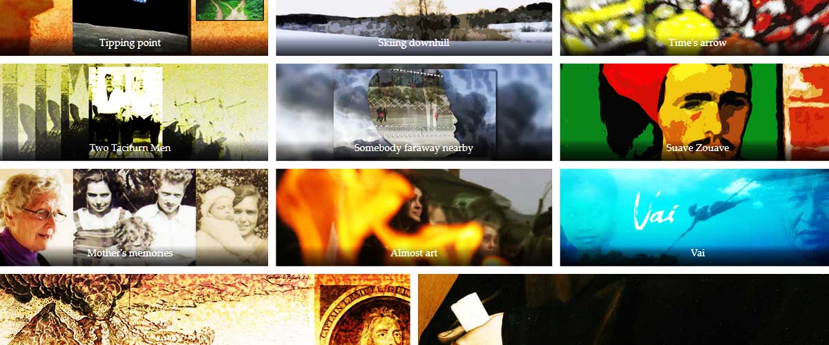
Header images gallery
As previously, I’ve chosen eleven images and put them into the gallery below. If you click on one of the pictures, you’ll open a slide show and be able to see each image full frame. However, if you click on the caption, you’ll find yourself whisked away to the post itself, so you can read it if you choose. Below the gallery you can read a little about each image. Scroll down for that.

From tipping point to time’s arrow
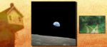
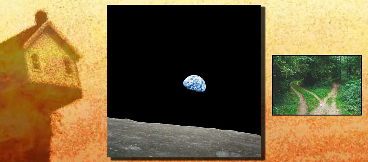
In my first Header Art post, I wrote that some of the new header images for older posts involved putting a single photo into a larger frame. Here, in a more recent piece, I took my well-Photoshopped picture of a house on a tipping point and used that as the background for two more images. The one to the right – the two paths – is another illo from the post. The central image, the fragile blue bubble of Earth seen from the Moon, was specially chosen for this picture. The alternative would have been to use the other illustration I made for the post, but I thought that would be too visually confusing. Usually I try to use my own original photos or art in my illustrations. In this case I took the original pictures from Creative Commons licensed sources (linked from the bottom of the post).

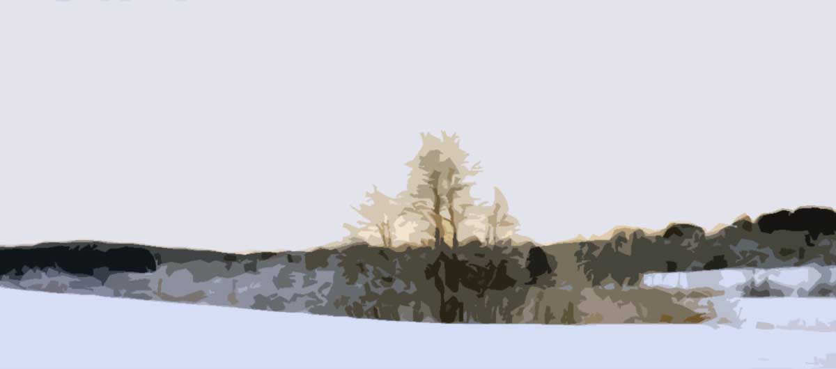
In Skiing downhill, I used a photo I took myself from BD (Before Digital). One of a set of four that I’d recently unearthed from a storage box and scanned. After scanning, though, the quality wasn’t great, so I “artified” it through Photoshop.
The third image comes from a flash story I wrote back in 2013 called “Time’s arrow thuds home”. I originally illustrated this (very crudely) with a digital line drawing. When I came to update it and make it a bit more presentable for the new look of my website, I added a colours and a watercolour filter. Blowing that up and cropping it for the header image the result was disappointing, so I think that’s when I added the zoom/spin blur effect.
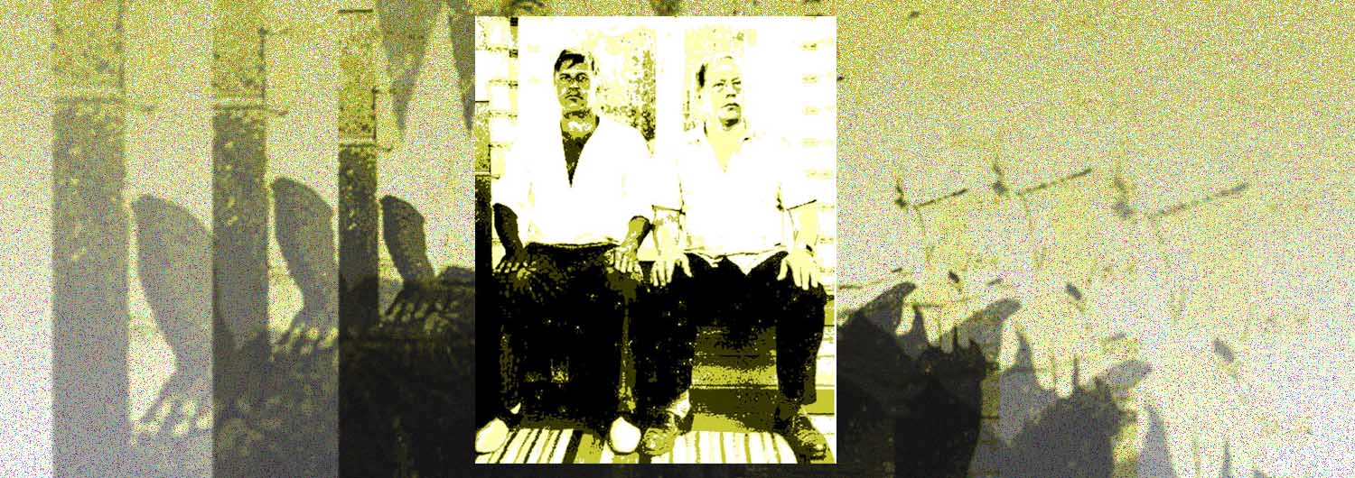
I used to know a taciturn Zouave
Two Taciturn Men stretches even further back, to 2010. I wrote the story and then started looking for an illustration, and found this still from a film by Pekka Parikka. The original is a low-quality image borrowed from the IMDb (probably). To make it more my own, again, I passed through various filters in Photoshop (or maybe Gimp).

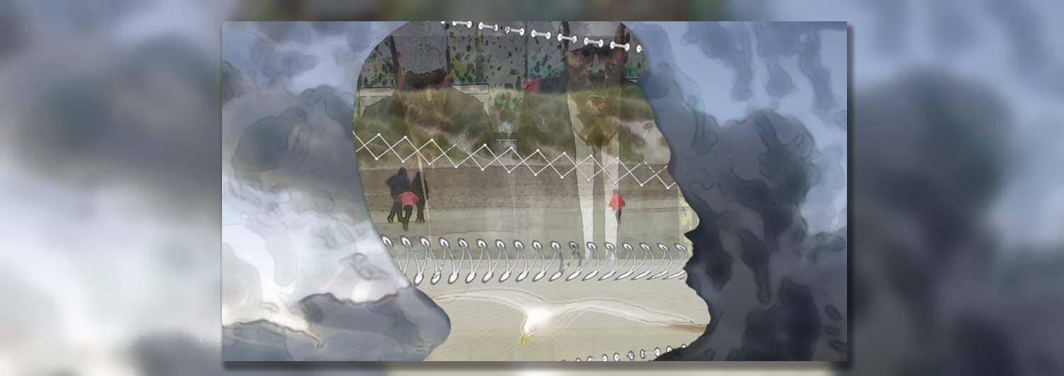
Somebody far away nearby is a review of two books about memory and thought. The one, by Wendy Mitchell, Somebody That I Used to Know, is about facing and fighting that horrible disease, Altzheimer’s. I wanted to illustrate this with brain fog, which I think I managed rather well. The half-seen family walking comes from a photo of mine. I’d like to believe the profile is of me, but I’m not sure that’s true. (It’s forgetfulness, I insist, not Altzheimer’s.) The stitches that hold memory together come from line drawings illustrating embroidery stitches.

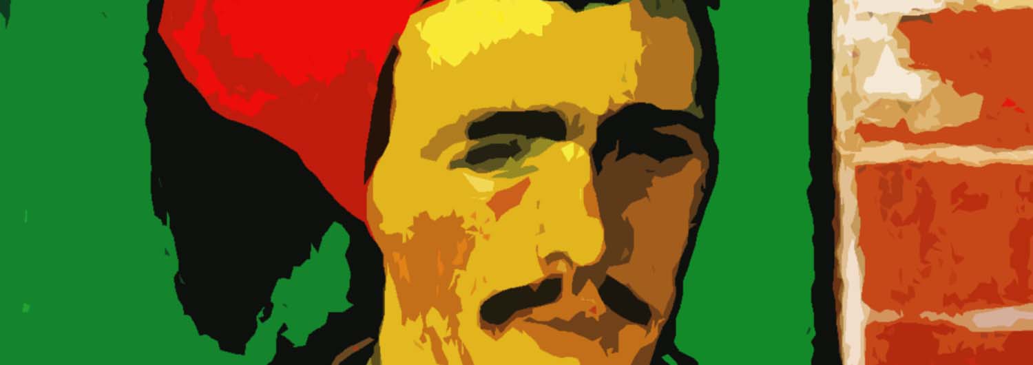
The Suave Zouave is stolen from Vincent van Gogh. It seems he was fascinated by these Arab soldiers in the French army, and perhaps especially by the colours of their uniform. (Yes, it’s a uniform.) There’s a painting, several sketches and at least one print. I think this is based on one of the drawings, but colourized using the colour palette in the painting. Then I’ve taken it a step or three further with other filters.
From the past through the flames to the South Pacific
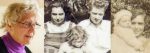
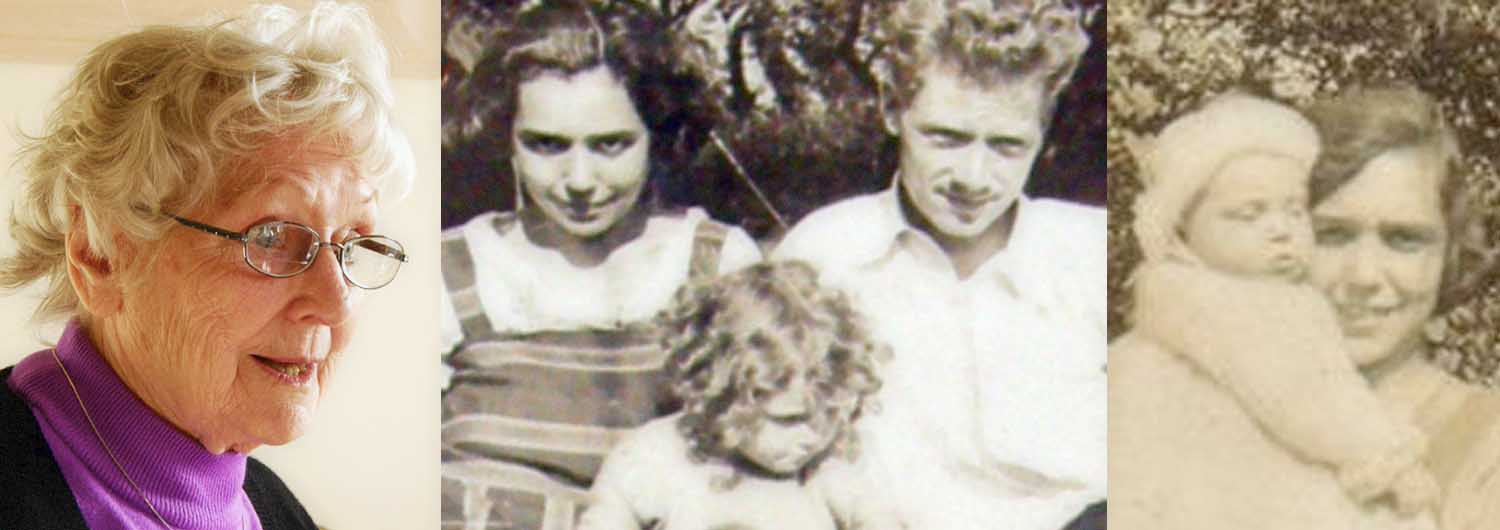
When I wrote about interviewing my mother about her life, she’d just turned 90. It seemed appropriate to illustrate this piece with a few pictures of her at different stages in her life. Then I had to choose the ones to put into the header image. I picked the earliest one I had (to the right), and what was then the most recent (to the left). In the middle is a family photo of mum with her parents when she was, perhaps three.

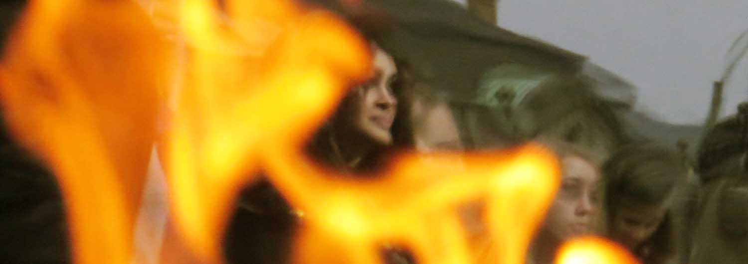
The header image for Almost art is a detail from one of my photos taken through the flames of an outdoor brazier. A crowd in the town square were gathered to listen to music or hear a talk. The heat of the air around the flames distorts the faces of the audience beyond. So it’s almost art.

All the parts of this next one, Vai, are images taken from the film’s trailer. I was particularly pleased with the glances from the youngest actress to the oldest, portraying women of the same name across the South Pacific. Also how I was able to unite all three images using colour.
Gulliver and Thomas
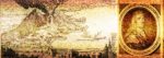
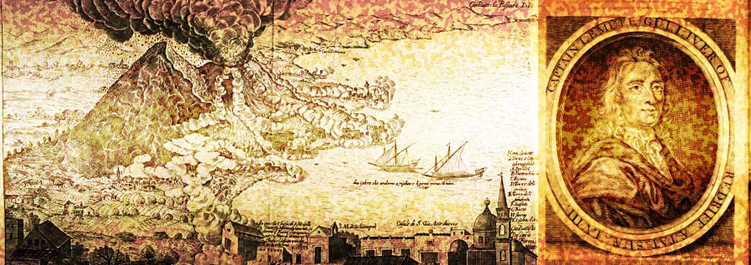
Capt. Gulliver’s Voyage to Borborygmus is another piece from many years ago. Like Two Taciturn Men it was inspired by a word game I was playing on Twitter in 2011. The story listed the chapter headings of a “lost” book of Gulliver’s travels, so it made sense to illustrate it with some “contemporaneous” images. I was particularly happy to find a portrait of the adventurous captain and ship’s doctor. The erupting volcano is from an 18th century etching depicting the eruption of Vesuvius.
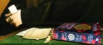
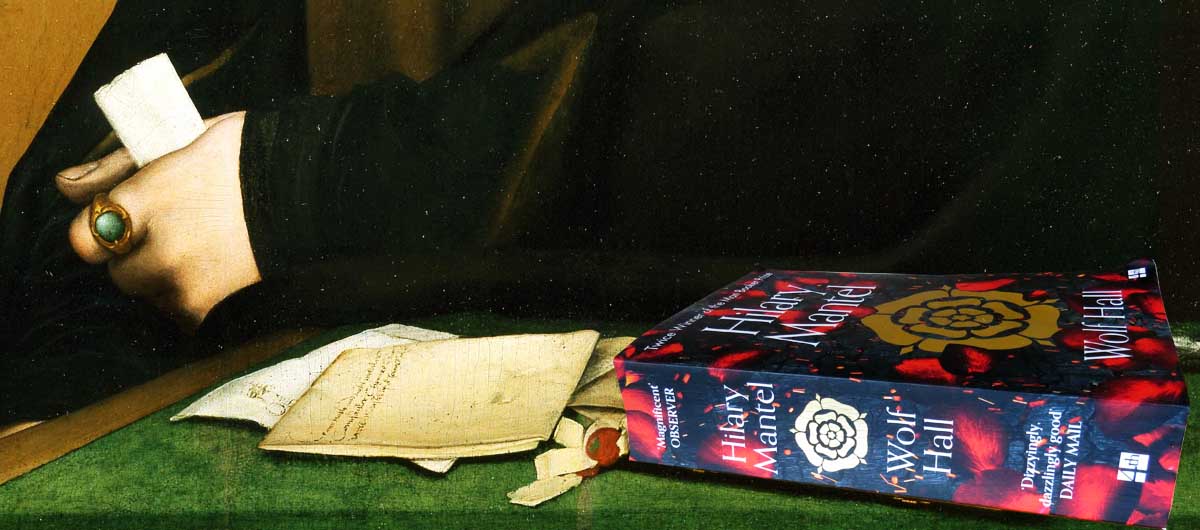
The last of these header images is my doctored detail of Holbein’s portrait of Thomas Cromwell. I replaced a book at his elbow with a picture of my own copy of Wolf Hall. I was rather pleased with that!
That’s it. There are very likely to be further posts of header images, to come, but that’s it for now. I hope you liked them!
As before, it seems redundant to add a Read me section to this post, so I won’t.