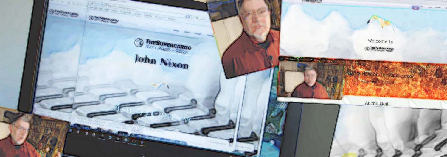
This video piece has been in the making for about four weeks. I fully intended to post it on 5th September – then again on the 12th. On the 19th I was prepared that it wouldn’t be ready, but today there is no alternative left in the cupboard, so I have to publish. It’s probably just as well. Without a deadline I might go refining it forever.
To begin with I had a script, but I’m so wooden when I’m reading it – and it was so long – that I decided to go another way. In the end I made the film, recorded myself talking as the film plays, and then spliced the one into the other. It makes for a more immediate – if more disjointed and vocabulary-poor – voice-over.
In the text below I’ve transcribed the VO. (It’s the pieces in the block quotes.) And I’ve added some comments, corrections and elaborations in the rest of the post.
Giving TheSupercargo.com a facelift
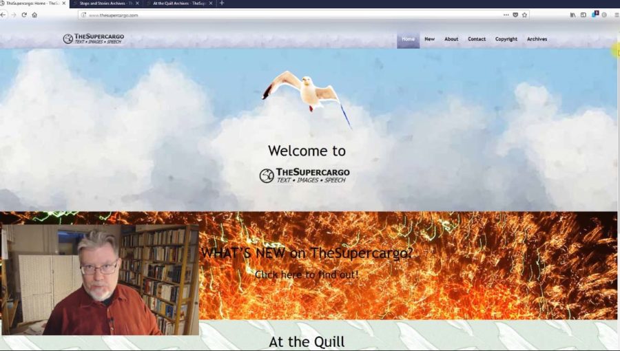
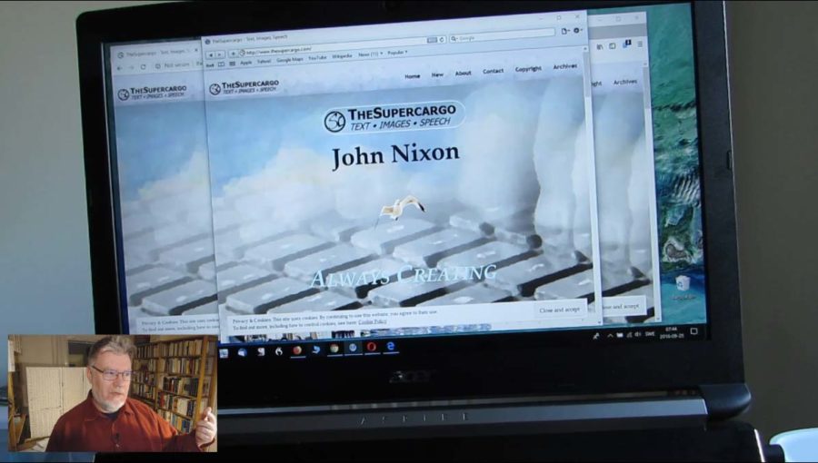
My name is John Nixon, TheSupercargo, and I am very interested in […] giving my website – TheSupercargo.com – a facelift. It’s been the same way for about three, maybe four years now, and it really needs to be improved a little bit. Let me show you the way it looks now.
That ellipses in square brackets is the only edit to the VO.
I’ve been blogging regularly on the website again since May and I’ve seen visits to the site increase month on month since April. However the front page – Home – though it’s the single most visited page, has a really poor click-through rate. Many see it, few go further.
What you can see is the static first page, and it’s static because it doesn’t change.
A statement of the blindingly obvious. This page gets about 14% of all my visitors and for most of them, this is all they see. If they give it enough time to load. That’s another problem. The loading time on this page is far too long – 5-7 seconds.
How it looks now
If you scroll down you’ll see that there are a number of links here.
There’s the link to At the Quill and the category At the Quill is where I have the different things that I write about reading and writing and self publishing. And you can see a few of them come up there.
Then if we go back to the static front page there is also another link there to Stops and Stories. Stops and Stories is my category for articles about travel or travel related things.
But the most important part of the front page, really, is the bit with all the fireworks on it. New. (The fireworks picture takes a hell of a long time to load, also.) But if you click on a New at the top, in the bar there, you come to the dynamic blog page.
I think the original idea I had was that visitors would scroll down this page and choose to click on the different links. Just as I’m doing in the film. But they really don’t.
So, on this page all of the new blog articles that I’ve written and published come up as they’re done.
Usually two or three times a week. Three times if possible.
NEW: the dynamic Blog page
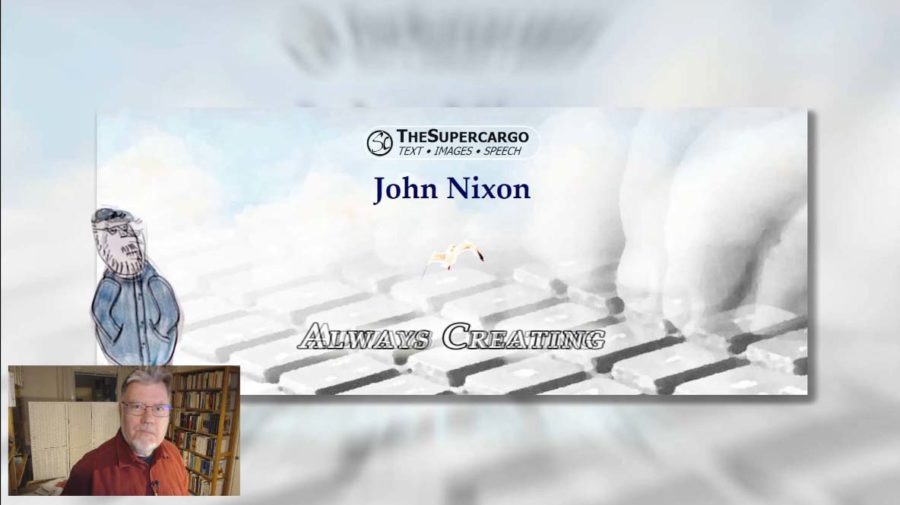
The Blog page – which I call my Commonplace page – is the second most visited page on the site. About 13% of all my visitors come here first. Some – certainly a greater proportion than on the front Home page – click through to view posts. At the beginning of September I added the right-hand column, which has several of the most active categories in it, and some visitors seem to be using that too. The plan is to turn this page into my front page but for that I need a better header image. Which is what this video is all about fixing.
But what you can see at the top there is the static header.
Now, if I get rid of everything, as I’m doing now, what you can see is – there’s the clouds at the top.
And what I have to do is to ask myself, does this really promote me as a creative artist? As a writer?
It’s very imaginative, the clouds, but not much else.
So I’m going to try and change things.
Capturing the freeze-frames
I’m happy using the header strip with the clouds at the top of the post pages, but here, especially if this page is going to do duty as my front page, I want something more writerly.
And I’m going to use a software called Movavi which is what this is now. It’s loading. And what I’m going to do is to capture freeze-frames
Now, at the very beginning of this you saw my typing fingers – behind the vlog – the Let’s Vlog with TheSupercargo – titles. So what I’m doing is taking the original – the raw material – and I’m making freeze-frames from it. And then saving the freeze-frames as individual pictures.
Then I use Gimp, which is free photo – photo manipulation software, to do some work with that. The Movavi, I’m afraid, you have to pay, for but the Gimp is free.
Movavi is proprietary software, but you can download a free 30 day trial. I think it’s very good, very intuitive. It’s not as powerful or as flexible as Adobe’s Premiere Pro, but it does the job very well. It’s cheaper than Camtasia. It has direct uploading to YouTube. You can get the latest stable version of Gimp here.
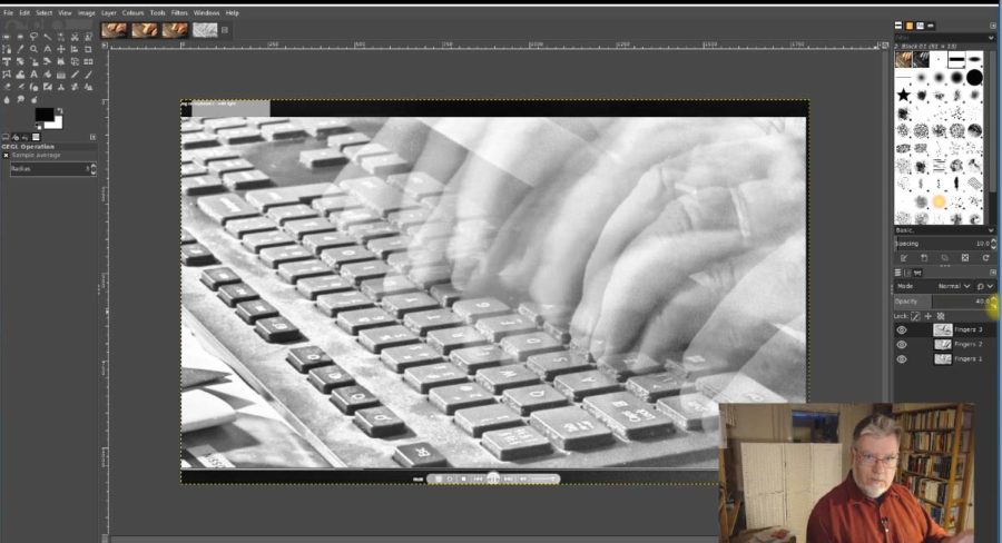
What I’m doing is, I’m taking those three pictures I took of my typing hands – I’m stacking them on top of one another in one image – and I’m going to manipulate this to give an appearance of typing fingers which I’m going to superimpose over the clouds. That’s the plan anyway. We’ll see how it works.
My mother was a touch-typist. She could type as fast as she could think. She tried to teach me, with no significant success. I was a forefinger point-and-peck typist for many years. Though I use more fingers nowadays I’m still not as fast as I could wish. Not as fast as the typing fingers in the title sequence of this video. (They are running in fast-forward mode.) The effect I’m after is a kind of blur of multiple fingers.
Processing the freeze-frames
First thing to do is to turn all of those coloured pictures into black and white because I don’t want the colour in the pictures interrupting, or messing with the colour in the clouds picture.
And then I’m going to just open them – change the opacity so that the fingers show through.And now what I’m doing is saving that as a document – so that I don’t lose it. (It happens all the time).
Now we are going to make the header, and what I’m going to do now is to open the picture of the clouds, this is the one I use on the website, and what you do is you look at it and you see that it has a certain size. The size is too small – it’s wide enough but it’s too short. So I’m going to make an image which is twice as tall.
Honestly, I’m not sure how important this is, but it seemed like a good thing when I was experimenting. Also I found it easier to manipulate the fingers with the extra space in the height of the canvas.
Making the new header image
Now I’m going to move the clouds up so that they’re at the top. And I don’t like that white, so I’m going to get rid of that. I’m going to replace it with the grey colour, which is at the very bottom of the clouds there.
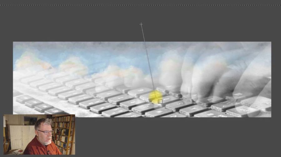
I’ve done that, and the next thing to do is to take the typing fingers and add them. So this is what’s happening here. Damn! There – I have to move them back up above the clouds. The typing fingers have to be above the clouds. There we are, that’s right.
Full disclosure. Gimp failed, froze and misbehaved repeatedly while I was filming this. Most of that footage ended on the (metaphorical) editing room floor. Enough for several blooper reels – though it’s really not very funny. Mostly boring. I think Gimp objected to being filmed by Movavi, though I can’t be sure.
Now what I’m going to do is mess around with this a little bit, as you can see, just change the shape of the picture. I’m going to rotate it a bit. I’m going to skew it a little bit. The idea is to have the typing fingers and the keyboard, but not to show off all the dirt and dust, which is on the keyboard. Not very nice. I’m slovenly with my keyboard. That’s the truth of the matter.
I noticed the dirt as soon as I desaturated the typing finger pictures. Turning them into shades of grey seemed to make it stand out more. I am reminded of that scene in Gattaca where Ethan Hawke’s character carefully vacuum cleans his keyboard at the end of each working day – and then tips Jude Law’s character’s finger dust and hairs back around the keys.
Gimp is free!
Now, we seem to have got that about right so the next thing – and this is the thing I think is really fun with Gimp, the latest version of Gimp has this – is to grade the … graduate the two pictures.
So this is the device for doing that. And as you can see, what you can do with this is to change the opacity of the top image and allow the bottom image to come through. I think it’s wonderful.
Anyway, that was a little bit of fun and it’s the principal reason why I used Gimp and not Photoshop. Also Gimp is free.
Did I mention that Gimp is free?
😉
Now we’re saving this as a JPEG, because JPEG works best with smooth pictures, and we’re also saving it as a small item.
And what I’ve just done now is to change … I’m adding an artistic filter to it. This is called oilify in Gimp, and the reason is – I like it. And also it abstracts the picture a little bit.
OK, to save a picture file from Gimp you have to export it rather than save it. I’m always forgetting. And I choose the JPG (JPEG) format because it is best for larger images without hard edges. It’s what everyone uses (should use) for photographs. I am saving this as a 40% quality image because the low quality means it will load faster. And I’m ‘oilifying’ it because (apart from me liking the effect) it creates blocks of colours that make the lower quality of the picture less obvious.
Adding the new header image to the website
Now, let’s go to put it onto the website.
First things first, this is the picture that the website – how the website looks before and now, let’s add this.
This is a dummy page. It’s … once I’ve made sure that works, I’m going to try to put that into the blog page.
This suddenly went faster than I was prepared for, but I think you can see in the film what’s happening. First I tested the new header out on a dummy page…
So this is the blog page – this is the dynamic page.
There we are. That’s what it looks like in the blog page. And what you see is there’s a parallax effect, which means that the lettering over the top seems to move in front of the clouds.
Then I put the new header into the top of the dynamic, Blog (aka Commonplace) page. I was going to show how I did this, but the film then ran to more than twice the present length. Also, though I’m using WordPress for my site, the many different themes that are available mean that the way I do this may well not work if you have a different theme. And if you’re blogging on a different platform, it’d be even more unhelpful.
As it is, the next section does show how to change the blog from showing a static front page to the world to using the blog’s dynamic one. If you use WordPress.
Changing the static front page to a dynamic blog page
Now, the next thing – the last thing to do really – is to change the global situation in the website so there is no longer a static front page but the blog page becomes the website’s front page.
And that’s what I’ve done now.
OK, now we’re approaching the end. I think the rest of the film is self explanatory…
Checking the website on different devices and in different browsers
And the next thing to do is to check it, and I’m sorry about this but I’m – I’ve got one hand on the camera and then one hand is trying to manipulate all the other things. But I’m testing it on different browsers.
So, in the computer that was Firefrox*. Here comes Chrome. The next one up will be Apple’s Safari.
They don’t make Safari for Windows any more. This is Safari 5 – it’s the last version of Safari that was made for Windows – but I test on that anyway. Then I’m going to test it on Edge and then I’m going to test it on Opera. And the reason is that these are – with the exception of Edge– these are the most used browsers in the world. So if it works on all of these browsers it’ll work on most browsers that anyone will use.I’m going to quickly check it on my surf pad. Which looks very nice I think. It looks better on the surf pad than it does on the computer screen, which is good. And then we’ll have a quick look at it on my little smartphone, and once again, also, it looks very pretty. I’m quite pleased with that
*Firefox!
According to Wikipedia the most used browsers in the world as of August 2018 are: Chrome (c.60%), Safari (c.14%), UC (c.6%), Firefox (c.5%), Opera (3.5%), Internet Explorer (c.3%), Samsung Internet (c.3%), Edge (c.2%). UC is a Chinese browser which I don’t have access to, and I don’t use IE on principle.
So that’s it, John Nixon, The Supercargo, Always Creating
This was an attempt to start – restart blogging, vlogging or something. Thank you very much for your attention!
I’m also publishing this article for the #Blogg52 challenge.



Wow! Vilket jobb! Men så fint det blev! Bra jobbat!
Kram Kim 🙂
Tack Kim. Kul att du tyckte om det. Videon var väldigt mycket arbete för väldigt lite avkastning, men jag är nöjd med den nya headerbilden åtminstone. Och jag är glad att jag lyckades göra videon – kanske den nästa kommer inte ta lika så mycket tid och ork..