The layout I use for my website (called a ‘theme’ in WordPress parlance) demands each blog post has a header image of a specific shape and size. (That would be 1200 by c.500 pixels, since you ask.) As the images I use to illustrate my posts usually don’t correspond to the shape and size of the featured image slot, each post’s header has to be designed and made specifically. Over the years I’ve produced dozens of these pictures. I think I’ve got making them down to quite a fine art.
I use the featured images not just at the head, but also as the linking image in the Read more slot at the foot of each post. Since I set up my social media landing page (for visitors from Instagram), I’ve been using them there too. And, of course, I use relevant headers in the website’s sidebar to promote my most popular posts.
A lot of the header images never really get a second chance though, and some of them I’m rather proud of. So this week’s post gives some of my favourites a turn in the spotlight.
Header image gallery
Directly below this paragraph is a gallery with eleven of my favourite images. If you click on one of them – on the picture rather than the caption – you’ll open a slide show and be able to see each image full frame. If you click on the caption, you’ll find yourself whisked away to the post itself, so you can read it if you choose. Below the gallery, I write a little bit about each image. Scroll down for that.




West Pier to Kew Gardens

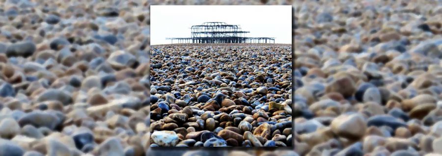
The first picture in the gallery, West Pier, shows one solution to the featured image problem. The square picture of Brighton’s West Pier is the principle illustration for the post. I’ve reproduced it, shrunk down to fit complete into the header image slot. To occupy the space around it there’s a close-up of the beach pebbles that fill the foreground of the photograph. I use this solution quite often with posts that feature a single photograph, but I’m particularly happy with this one. Also it’s from my home town.

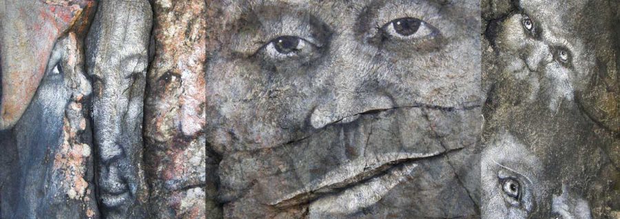
The second gallery picture, Faces in the Rocks, is a featured image making use of several photographs from a picture essay. The collage of image clips is another solution I like and I think it works well for posts displaying several photos. Particularly well here as it gives me the opportunity to incorporate several different faces.

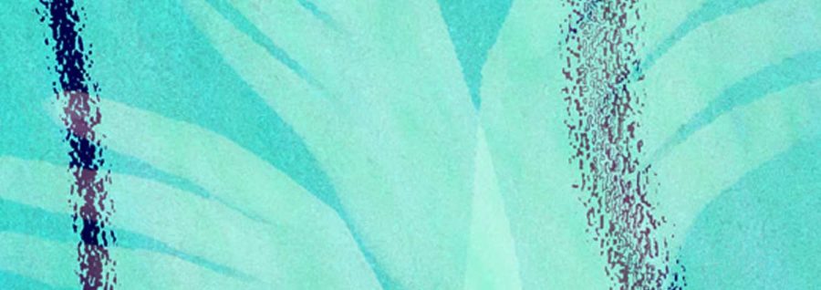
Pleasures of swimming, is a detail strip from a larger picture I created in Photoshop as this post’s illustration. The hands and arms in the picture I made by tracing them roughly from a portrait photograph I took of one of my nieces. They are duplicated and overlaid on a distorted picture of water in a swimming pool, which I think I created digitally from scratch. I say “I think” because the original picture here must be 12 years old or more. The post itself I published in 2012.

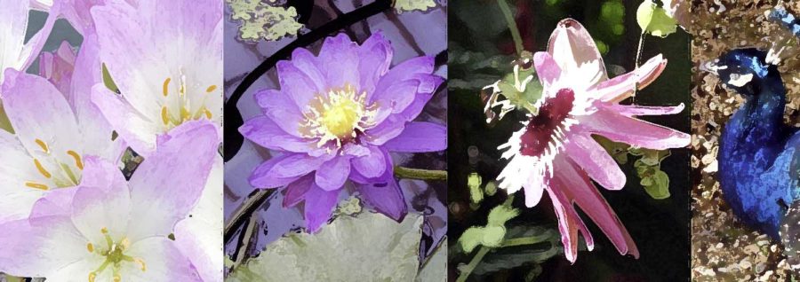
The next picture, Kew Gardens, is another collage of details culled from photos in a gallery. The added twist here is that I have changed them in Photoshop to look like watercolour paintings.
Ten thousand proportional

Ten thousand hours is a much more recent post: published in May 2020. The picture is older though. I found the tortured typewriter out in the sun on a table in the Jewish ghetto of Cracow a good six or seven years before I used it here. Often, I find myself snapping odd pictures that I don’t know when I’ll use. I keep them and hope that one day the perfect opportunity to share them will come along.

The picture of London’s Tower Bridge and the stylised coronavirus particles is another bit of artfulness I was quite pleased with. I took the photograph myself during my wanderings around London just as the cronavirus pandemic was first beginning to bite. The representation of the virus is taken from an illustration on Wikimedia Commons, and then multiplied. The whole picture has been treated with one of Photoshop’s stock textured canvas patterns.

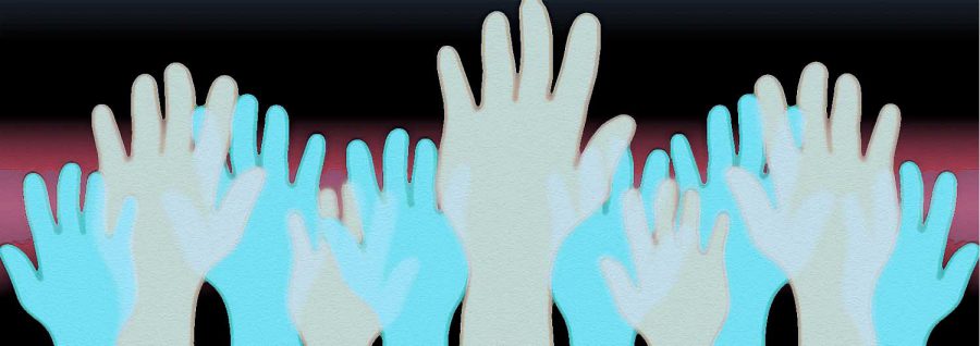
I don’t often write politically inspired pieces, but the longer I live under other forms and expressions of democracy, the more bizarre and, frankly, undemocratic I find the British electoral process. I thought it back when I wrote this piece during the general election of 2010, and I think it still. Proportional representation is the oldest post represented here – from May 2010. One of these hands started out as a tracing of my left hand. I scanned it into the computer then went to work on it, stylising it, flipping it and colouring it in.
Bad Behemoth

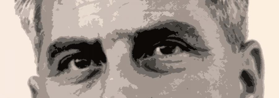
Bad timing is a poem I wrote for a collection of poems made out of family stories. I suppose every family has them, things that happened to family members years ago, repeated to rising generation so they weave into a family mythology. Stories before Birth, I was going to call it, the collection. I never completed it. No, I should say: I haven’t completed it yet. The poem recounts a story told about my father (thought I don’t think I ever heard him tell it). The illustration shows a close-up of Dad’s eyes taken from a scanned negative my mother gave me

Half full? is based on a photo I took in a bar. There was this half full glass of red wine, spotlit on the bar counter against the white shirt of a guy with his back to it. I think there was a live band playing and he was turned to watch them. It was just too dramatic not to snap. I couldn’t decide what to do with it… But then it turned out to be perfect for this little post.

Behemoth passing is a post about the death of my workhorse computer, Behemoth. So named because, when new, it was the biggest PC I’d ever owned, physically and in terms of its memory capacity. Opening it up to see what could be salvaged, I was struck by all the colours of the circuit boards, wires, heat sinks and fans. It was too good not to photograph. (I replaced Behemoth with a new, more powerful but physically smaller computer I call Little Moloch.)
Slender ending

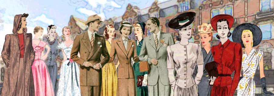
The final image from the gallery heads a reading diary entry from July 2018. Mostly about Murial Spark’s novel The Girls of Slender Means. I wanted to illustrate this with a picture from roughly the same time period as the book is set (1945) or from when it was published (1963). I ended up with something that is, I think, a bit more reminiscent of the 1950s. I’m not sure where the idea for clipping out figures from sewing patterns came from, but that’s what they are. Front cover illustrations from vintage sewing patterns collected from Etsy and EBay.
That’s it. I could easly share another series of header images, and maybe I shall later on, but this is it for now. I hope you liked them!
It seems a little redundant to add a Read me section to this post, so I won’t.

